Priffle
preferred digital agency
About Project
Website / 2021
Deliverables
UX Research, Information Architecture, Wireframes, Design System, UI Design & Interaction Design, Visaul Design
My Role
Research, Product Design
I understand that every business is unique, and I take the time to get to know them and their goals before I start working on visual identity. This allows me to deliver the best design solutions that are tailored to my clients.
Chats about what kind of business it is, who the target clients are, where the business should be going, and how it can get there. I started these chats with Priffle to define who they are and what they do. These are Priffle chats.
Who is Priffle?
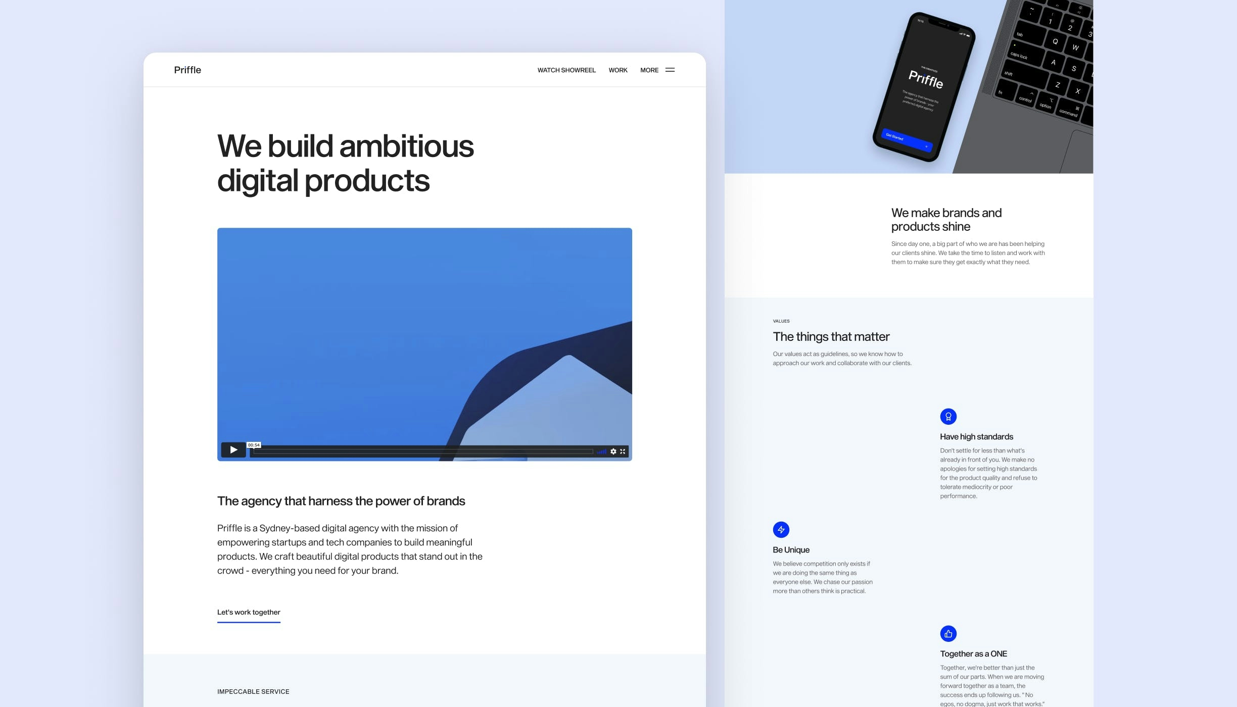
Priffle is a Sydney-based digital design and development agency, with the mission of harnessing the power of brands and making them stand out in the crowd.
What are their goals?
- Priffle needed a strong brand identity that would help them build brand recognition and awareness through a cohesive brand image, setting Priffle apart from the competition.
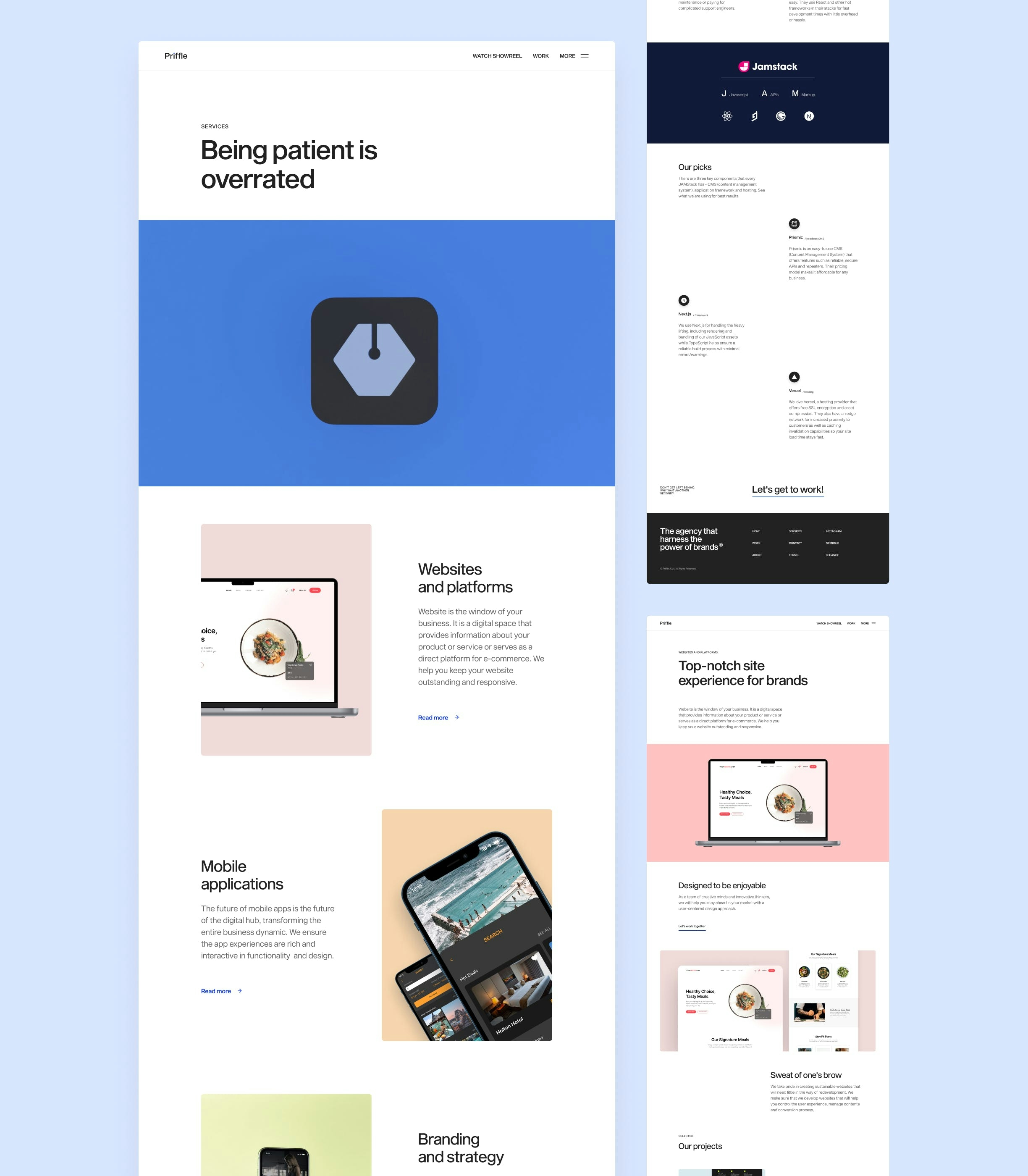
- Priffle required a bespoke website that would allow them to effectively showcase their work and attract more leads while also promoting their brand with great user experience and clean and superior design.
Branding and Visual Identity
I started by describing Priffle's mission, goals and values, as well as its personality, which are so crucial in determining the creative direction and allowing me to explore ideas and concepts for the visual identity.
Here are the keywords when describing Priffle: Innovative, creative, enthusiastic, cutting edge, witty. With those in mind, I explored a variety of ideas and created a mood board that would illustrate how it will appear as well as how it will feel.
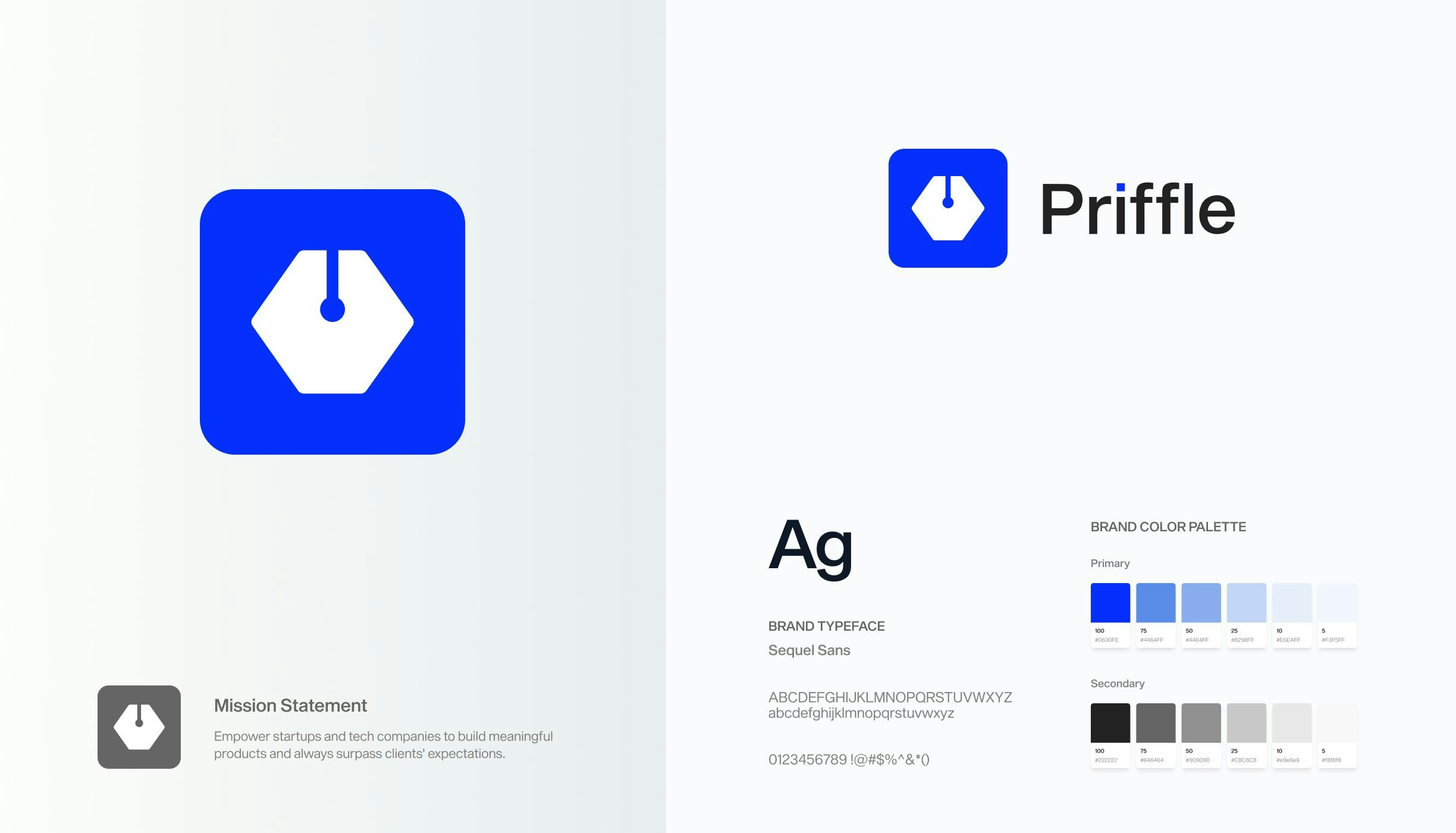
Logo. Simply put, Priffle "designs" and "codes" digital products. The shape formed by the symbols of "pen tool" and "coding (</>)" is distinctive, straightforward, and bold in expressing Priffle's personality. I also made a 3D logo and animation for use in the showreel and website later on.
Typography. I went with Sequel Sans for the brand typeface since it is contemporary, clean, and versatile, as well as having beautiful curve and clean edge that enhances the aesthetics of typography layout.
Colors. The brand color is bright blue, which I chose to highlight the Priffle's personality and emphasize the innovative, creative, and passionate aspect of Priffle. To be able to work with a variety of companies collaboratively, I also wanted Priffle's hue to be neutral.

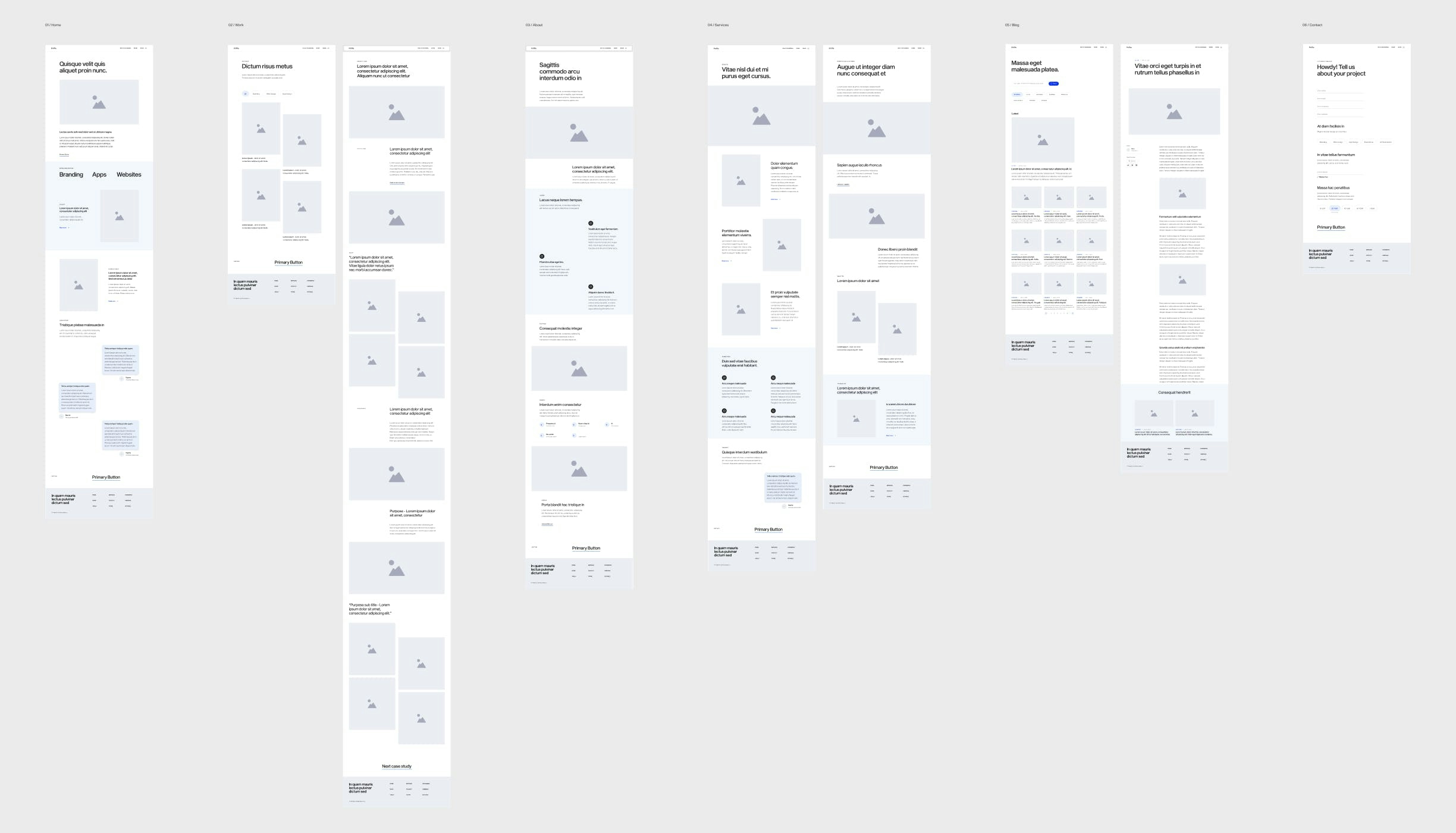
Wireframe
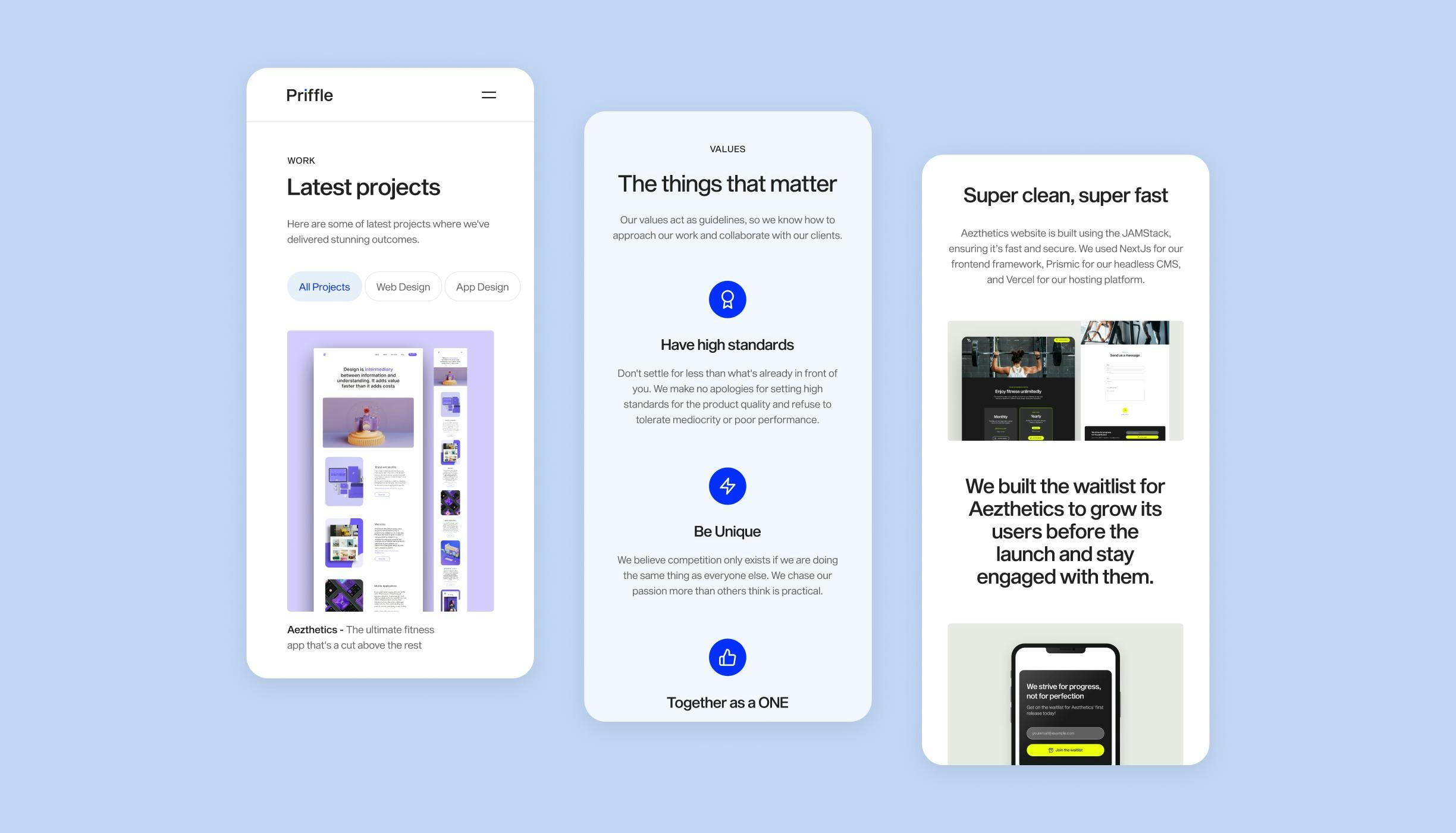
After mapping out the structure of the site, I started working on wireframes to achieve the primary goals of this website which was to deliver the great user experience and attract potential clients.
The site was designed to be easy to use and enjoyable and to showcase work and case study effectively, telling clients who they are and what they are capable of. Unnecessary features and steps were eliminated in order for users to locate what they need easily.
Minimal design at its finest
I aimed to design UI elements and the visuals that are super clean, minimal and attractive. I focused on getting rid of anything that doesn't serve a purpose or improve the user experience in some way.
Minimal design doesn't mean it looks boring. I didn't want to overwhelm users with too much information scattered all over the site because Priffle had a lot to offer their clients. By effectively utilizing white spaces to organize information clearly and displaying beautiful visual designs, I was able to produce a clean and attractive website.